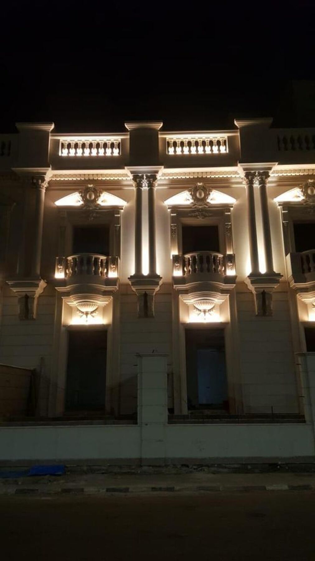
The client's brief was one sentence: "People walk past us." The store sat on a good street, in a good development, with good product inside — and at night it disappeared. Not because it was dark. Because it was evenly lit.
The problem wasn't brightness. It was sameness.
The original scheme was a grid of downlights at uniform spacing, all the same output, all the same colour temperature, washing the whole shop at one flat level. It's the most common retail lighting mistake we see in the region, and it comes from a reasonable instinct: more light must mean more visible.
But the eye doesn't read brightness. It reads difference. A space lit evenly at 700 lux is visually silent — there's nothing for attention to land on. Walk past it and your eye finds no reason to stop, because nothing is more interesting than anything else.
Uniform light makes a room visible. Contrast makes it worth looking at.
What we changed
1. We built a contrast ratio instead of a light level
We dropped the ambient level and introduced accent lighting on the merchandise at roughly a 5:1 ratio to the surrounding surfaces — bright enough to create a clear focal hierarchy, restrained enough to avoid the "interrogation room" effect. Feature displays went higher still. The overall installed load actually went down, and the shop read as significantly more premium.
2. We lit vertically, not just downward
Product sits on walls and shelves — vertical surfaces — but a downlight grid throws light at the floor. We shifted a large part of the budget to wall-washing and shelf-integrated linear lighting. Vertical illuminance is what makes a space feel bright from across the street, and it's what actually renders the product to a customer standing in front of it.
3. We treated the window as a stage, not a wall
The storefront glazing was previously lit by whatever spilled out from inside. We gave it dedicated, aimable accent lighting with the display itself as the brightest thing in the visitor's field of view — and deliberately kept the ceiling above it dark. The window stopped being a transparent panel and became a lit object.
4. We fixed the colour
The original fixtures were around 4000K with a modest CRI. Fabrics looked grey; warm materials looked dead. We moved to 3000K at CRI 90+, with high R9 (deep red rendering) where it mattered. Nothing about the product changed — but the product suddenly looked like itself.
The glare nobody notices until it's gone
The old downlights had shallow recess and visible lamps. Every customer looking up at a shelf caught a bright source in their peripheral vision. Discomfort glare doesn't announce itself — people don't say "there's glare," they just don't linger.
Deep-baffled, well-shielded fixtures with a proper cut-off angle solved it. Dwell time is the retail metric nobody lights for, and it's the one lighting affects most directly.
What actually drives sales
- Contrast draws the eye — a focal point people can see from the street.
- Vertical light sells product — it's the surface the customer is actually looking at.
- High CRI protects your margin — a fabric that looks washed out doesn't get bought.
- Glare control extends dwell time — comfortable people browse longer.
- Warm tone builds perceived value — 3000K reads premium in a way 4000K rarely does.
The takeaway for any retail space
If your shop is well lit and still invisible, the answer is almost never "add more light." It's usually to take light away from the background so the product has somewhere to stand out against. Contrast is free; it costs nothing but the discipline not to light everything equally.
Different retail, different light
"Retail lighting" isn't one discipline. What the product is changes almost every decision.
Jewellery and watches
The goal is sparkle, which comes from tight, punchy beams from multiple directions hitting facets — not from overall brightness. Very high contrast, narrow optics, and careful heat management inside display cases. CRI and R9 are non-negotiable: a diamond under poor-quality light looks like glass.
Fashion and textiles
Here the enemy is colour distortion. Customers make buy/no-buy decisions on how a fabric reads, and if the fitting-room light differs from the shop floor, you generate returns. Match colour temperature and CRI across the whole journey, and light fitting rooms vertically at face height — flattering, even light on the person, never a single downlight casting shadows under the eyes.
Furniture and homeware
Large objects need modelling — light from more than one direction so form reads three-dimensionally. Room sets should be lit at roughly the level they'd have at home, or the customer can't imagine the piece in their own space.
Food and grocery
Colour rendering directly affects perceived freshness. Different departments genuinely want different tones — bread and baked goods sit best under warm light; fresh produce needs high R9 to read as ripe rather than tired.
Numbers worth knowing
- Accent-to-ambient ratio 3:1 — noticeable emphasis. 5:1 — clear focal point. 10:1+ — dramatic, for hero displays only.
- CRI 90+ with R9 above 50 for anything where colour affects the purchase.
- 3000K for premium and warm-material retail; 3500–4000K where a clinical, technical read is wanted.
- Vertical illuminance on merchandise matters more than the horizontal (floor) figure most specs quote.
- Unified Glare Rating — keep sources out of the customer's normal sightline entirely.
Five mistakes we see most often
- Lighting the floor. Customers don't buy the floor. Aim at product.
- One colour temperature chosen by price. Mixed or wrong tone undermines every material in the shop.
- Over-lighting the ambient. It flattens contrast and removes the reason to look anywhere specific.
- Fixed optics in a shop that changes. Retail displays move; specify aimable, re-lampable fittings on track where merchandising will change.
- Ignoring maintenance. One dead lamp over a hero display is worse than a slightly dimmer scheme that stays complete.
Frequently asked questions
Does retail lighting really affect sales?
Yes — through three mechanisms: attracting attention from outside, extending dwell time inside, and rendering product colour accurately so it looks worth its price. Lighting doesn't create demand, but poor lighting suppresses it.
Will better lighting increase my electricity bill?
Usually the opposite. Most schemes we replace are over-lit at uniform levels. Designing with contrast means less total light, better placed — this project's installed load went down while the shop looked substantially brighter.
What colour temperature is best for a shop?
For most premium retail in the Gulf, 3000K. It flatters skin, wood, stone, gold, and warm fabrics. Cooler tones suit technical or clinical products, but read cheaper in a luxury context.
Can you improve an existing shop without a full refit?
Often yes. Re-aiming existing fittings, changing optics and lamps, and adding a dedicated window scheme can transform a space without touching the ceiling.
We work on retail projects across Saudi Arabia and the UAE, from single storefronts to full showroom fit-outs. If you'd like to know what your space would look like designed this way, tell us about your project — or read how lighting design is priced first.